The Journal
Colour Psychology in Abstract Painting: Choosing the Right Mood for Each Room
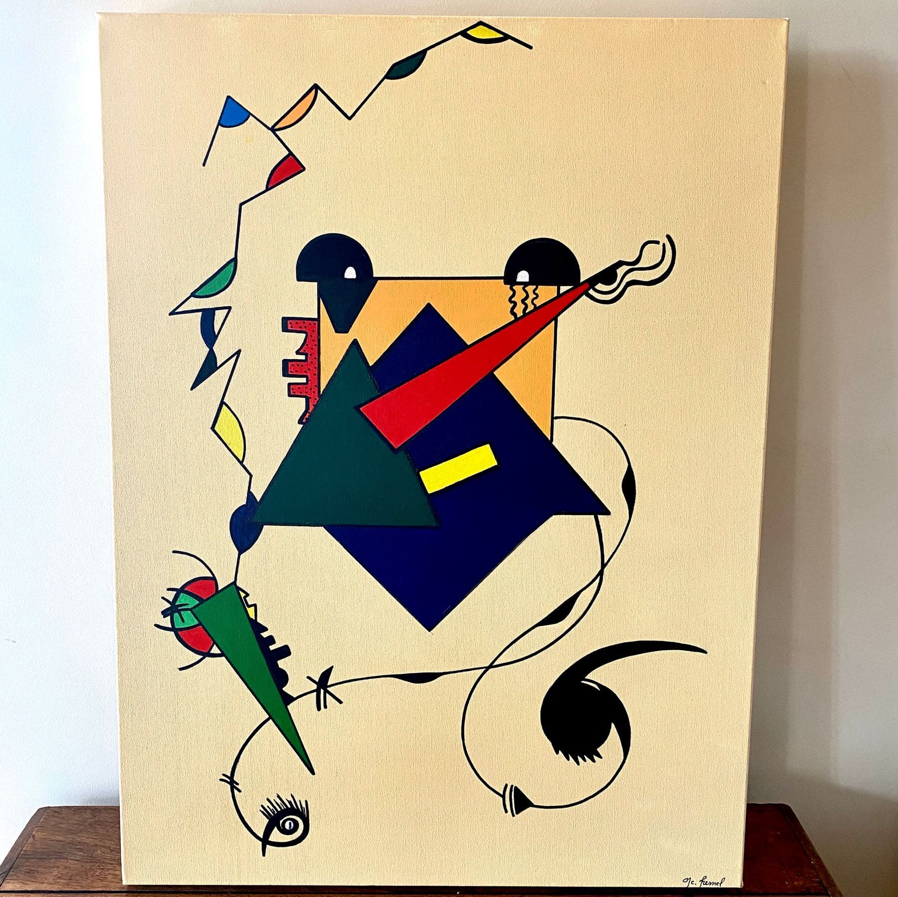
Before you even try to read an abstract composition, its colour speaks first and sets a mood. From Goethe to Kandinsky, by way of my own canvases, a look at colour psychology to help choose an abstract painting for the room and effect you want.
The same canvas hung in a bright living room or a dimly lit bedroom doesn't quite tell the same story — and it isn't only about light. Long before anyone tries to read an abstract composition, it's the colour that speaks first and sets a mood, before the eye even lingers on shape or texture. In this Journal article, I look at colour psychology as it applies to abstract painting: what each colour family tends to convey, what art history has to say about it, and a few simple pointers for choosing a painting to suit the mood you want, room by room.
Why colour acts before subject matter, especially in abstract painting
In front of a figurative painting, the eye first tries to identify what's depicted; in front of an abstract canvas, it has only colour, shape and material to go on — so colour carries a disproportionate emotional weight. Research in environmental psychology shows that perceiving a colour triggers a measurable response before any conscious interpretation: red tends to slightly raise heart rate and alertness, blue tends to calm it. An abstract painting, precisely because it doesn't tell a literal story, lets that chromatic response come through without being redirected by a recognisable subject.
From Goethe to Kandinsky: a brief history of colour as an emotional language
The idea that colour carries its own emotional charge is nothing new. As early as 1810, the German poet and scholar Johann Wolfgang von Goethe published his Theory of Colours, already contrasting the hues he considered "positive" — yellow, orange, red, associated with warmth and energy — with the "negative" ones — blue, blue-violet, associated with calm and, at times, melancholy. A century later, Wassily Kandinsky picked up and extended the idea in Concerning the Spiritual in Art (1911), describing yellow as a colour that "disturbs man" and blue as one that "invites repose". This conviction — that a hue can act on the viewer's inner state independent of any subject — sits at the very foundation of early abstraction.
Warm, cool, saturated, muted: what each colour family tends to evoke
- —Reds and oranges — energy, warmth, vitality; best used sparingly in an already busy space like an entryway or dining room, rather than a room meant for rest
- —Yellows — optimism and clarity in small doses, but can turn restless if they dominate an entire composition or a large stretch of wall
- —Deep blues and greens — calm, focus, stability; particularly well suited to a bedroom, a home office or a reading corner
- —Highly saturated colours — energise a neutral room, but tire the eye over time if they linger in a space meant for rest rather than one you pass through
- —Muted or broken tones (terracotta, ochre, coloured greys) — a balance between warmth and calm, blending easily into interiors that already carry colour
Which mood for which room: my practical guidelines
These are not hard rules — how a colour feels is always partly personal and cultural — but they're a useful starting point, especially when an abstract canvas covers a large wall and will be looked at every day.
- —Bedroom — favour deep blues, muted greens or a soft monochrome like Blanc Immaculé, which doesn't impose energy right before sleep
- —Living room — the most chromatic compositions naturally belong here, a space for living and conversation where a piece like Insouciance or Carioca can fully embrace its vitality
- —Home office or work corner — stimulating but not restless colours: a controlled orange or a touch of yellow support focus without causing visual fatigue
- —Entryway or hallway — a contrasted, energetic piece sets the tone the moment you walk in, without you lingering there long enough for the effect to become tiring
My own palette, between energy and calm
In my own work, this tension between colours that energise and colours that calm is never really resolved — I'd rather keep it alive within a single canvas than pick a side. Trained between Buenos Aires and São Paulo, I grew up with an exotic, saturated palette, the one found in canvases like Carioca or Exoticis Colorum; but I work just as much with more muted, near-monochrome harmonies, as in Blanc Immaculé. The choice is never purely aesthetic — I often think about where a piece is likely to live, in a collector's home, well before I've finished it.
A colour never just dresses a canvas: it sets a temperature, a rhythm of breathing, a way of occupying a room — that's the dimension I keep in mind with every pass of the knife.
During my exhibitions in France, Spain and Andorra, I often notice which canvases draw the eye depending on the light and mood of the venue — something I also cover in the article on preparing an exhibition hang. You can explore all my paintings, from the most vibrant palettes to the most restrained monochromes, in the Full Collection, or find the dates of my upcoming exhibitions on the News page.
Tags
Frequently Asked Questions
Is colour psychology an exact science?+
Not quite: some physiological effects (red slightly raising alertness, blue calming it) are documented by environmental psychology research, but how a colour feels is also shaped by culture, personal memory and context. Treat these guidelines as a useful starting point, never as a strict rule.
What colours work best for an abstract painting in a bedroom?+
Deep blues, muted greens and soft monochromes suit a room meant for rest best, since they don't impose energy right before sleep. A highly saturated red or orange, on the other hand, tends to suit a living room or entryway better than a bedroom.
Can a very colourful painting work in a home office?+
Yes, as long as the intensity is measured: a touch of yellow or a controlled orange can support focus without tiring the eye, while a fully saturated composition in a large format can become distracting in a space you work in every day.
Do you need a single dominant colour per room?+
No, that's not a requirement. What matters is coherence between the painting's dominant tone and the room's existing colours — a neutral interior can carry a saturated piece well, while an already colourful room often benefits from a more restrained, quieter painting.
Does the size of the painting also affect the mood of a room?+
Yes — size and colour work together: a large, saturated piece takes up more emotional space in a room than a small painting in the same palette. I cover sizing and placement guidelines by room in the article on pairing an abstract painting with your home decor.
Discover the works
Browse the full collection of original abstract paintings by M. C. Lamamie de Clairac.
View the Collection →