The Journal
Colour Theory in Abstract Painting: How to Build a Palette That Works
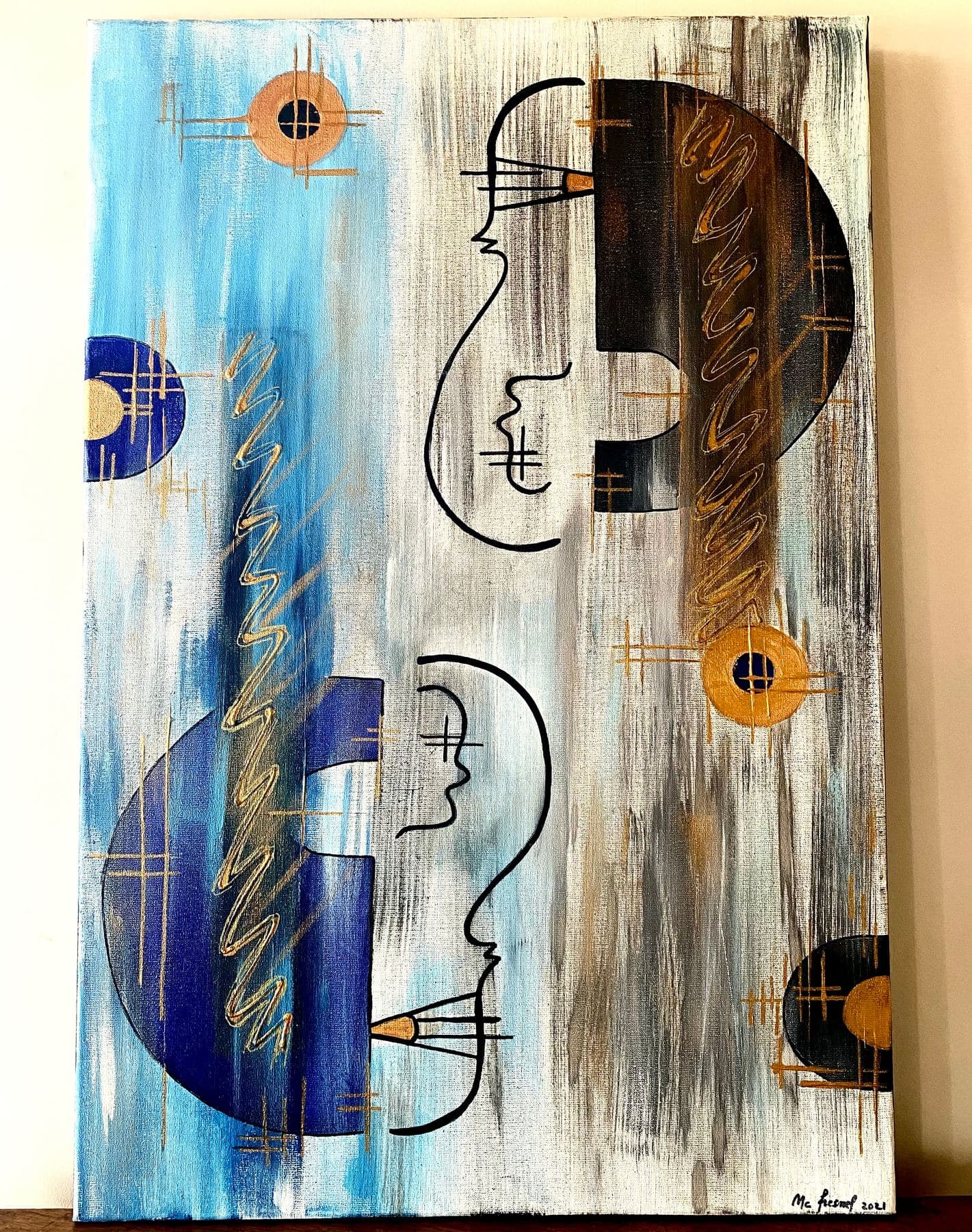
"How do you choose your colours?" It's the question that comes up most often, right after the one about price. Contrast, harmony, temperature: here's how I build a palette that holds together, canvas after canvas.
"How do you choose your colours?" That's the question that comes up most often at my exhibitions, right after the one about price. Contrary to popular belief, a palette that works owes nothing to chance or to a simple gut feeling — it follows principles of contrast and harmony that are nearly two centuries old, principles that geometric abstraction makes far more visible than figurative painting, where the subject usually pulls attention away from colour itself. Trained in Buenos Aires and São Paulo before settling in the Tarn, here's how I apply the basics of colour theory, canvas after canvas, in my own studio.
What is colour theory, and why does it matter so much in geometric abstraction?
Colour theory covers the principles that govern how colours interact with one another: which hues reinforce each other, which cancel each other out, which create a sense of depth or movement. In a figurative painting, these mechanisms often stay in the background, masked by the depicted subject. In a geometric abstract composition, where no scene distracts the eye, colour literally becomes the subject — it's what builds the balance of the canvas, just as much as line or shape does. Understanding these principles doesn't dampen the spontaneity of the gesture — if anything, it gives you the tools to master it.
Complementary contrast: a law nearly two centuries old
We owe the formulation of the law of simultaneous colour contrast to French chemist Michel-Eugène Chevreul, in the first half of the 19th century: two complementary hues — opposite each other on the colour wheel, like blue and orange, or violet and yellow — each appear more vivid when placed side by side than when seen separately. A century later, Swiss painter Johannes Itten, who taught colour at the Bauhaus, systematised that intuition into a full method still taught in most art schools today. That same principle structures much of contemporary geometric abstraction: complementary contrast creates a visual tension the eye never tires of following.
Five principles for building an abstract painting palette that holds together
Here are the markers I use myself before the first layer of paint touches a canvas:
- —Choose one dominant colour and build the composition around it, rather than lining up several hues of equal visual weight
- —Lean on a pair of complementaries — blue and orange, violet and yellow, red and green — for maximum contrast without losing the canvas's balance
- —Keep the most saturated colour to a smaller area — too generous a block of the boldest hue overwhelms the rest of the composition instead of structuring it
- —Let a vivid palette breathe with a more neutral zone — white, grey or black — that gives the eye a pause between two areas of intense colour
- —Test the palette at a small scale before committing to the final format — a harmony that works on a ten-centimetre sketch doesn't always hold up on a large canvas
Warm colours, cool colours: composing with temperature, not just hue
Beyond the colour wheel, every colour carries a perceived temperature: red, orange and yellow read as warm — they seem to advance toward the viewer and take up space; blue, green and violet read as cool — they seem to recede and open up depth. A geometric composition that alternates warm and cool surfaces creates movement and rhythm even without a single curved line or expressive brushstroke — colour alone makes the planes advance and recede against one another.
A colour never exists alone on a canvas — it's only truly itself in contact with its neighbour.
My palette: a Latin American inheritance, calculated in my studio in the Tarn
My own palette inherits directly from the concrete and neo-concrete tradition I trained in between Buenos Aires and São Paulo: bold, saturated colour rather than a restrained one. Polarité Opposée in fact takes its title from this very principle of complementary contrast, pushed to its most tense point. In Reflets de Joie or Synthèse d'Or, it's a dominant colour — warm and golden — that structures the canvas, punctuated with cooler accents to avoid monotony. And in Blanc Immaculé, where colour nearly disappears altogether in favour of a range of whites and creams built up with a palette knife, it's colour theory itself that, through its near-total absence, hands the stage over to texture and relief. You can see these three approaches side by side in the Full Collection, and find out at which upcoming exhibitions across France, Spain and Andorra you can see these contrasts in real conditions on the News page.
Tags
Frequently Asked Questions
What is colour theory in painting?+
It's the set of principles describing how colours interact with one another — complementary contrast, harmony, warm or cool temperature — to create balance, tension or movement in a composition. In geometric abstract painting, where no figurative subject distracts the eye, these principles become the very core of how the canvas is built.
How do I choose complementary colours that work well together?+
The simplest approach is to start from two hues opposite each other on the colour wheel — blue and orange, violet and yellow, red and green — then deliberately unbalance their proportion: one dominant colour across a large area, the other reserved for a smaller accent. An even split is usually harder to balance visually than a weighted one.
Do I need to use as many warm colours as cool ones on the same canvas?+
No, that's not necessary — what matters is deciding which of the two families should dominate, depending on the effect you're after. A majority of warm colours visually brings the composition closer to the viewer, while a majority of cool colours creates depth; a few touches from the opposite family are usually enough to balance things out.
Does a nearly monochrome painting still follow colour theory?+
Yes, though the logic shifts: without chromatic contrast, it's variations in value (lighter, darker) and the texture of the paint itself that take over to structure the composition — as in my painting Blanc Immaculé, built entirely with a palette knife in a range of whites and creams.
Can I see these colour contrasts in person before buying a work?+
Yes. My paintings can be seen at my exhibitions across France, Spain and Andorra, with the calendar published on the News page; you can also reach out directly through the Contact page with any question about a specific work's palette.
Discover the works
Browse the full collection of original abstract paintings by M. C. Lamamie de Clairac.
View the Collection →