The Journal
Composition in Abstract Painting: Balance, Rhythm, Focal Point and Negative Space
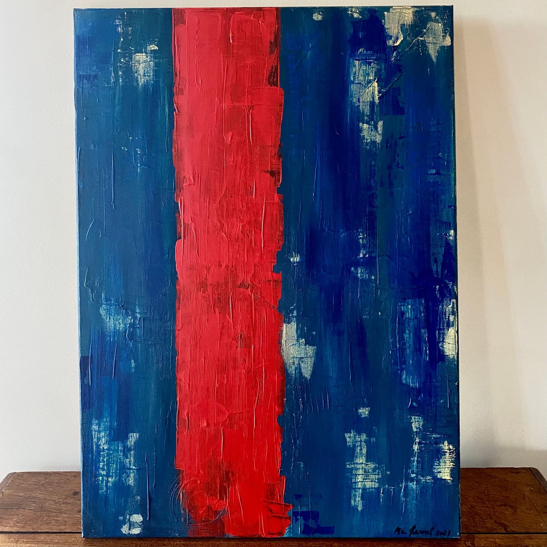
Standing in front of an abstract painting, the eye often looks for a subject before it looks for anything to hold onto. Yet it's composition — how shapes, masses and empty space are arranged on the canvas — that decides whether a work holds together, long before colour enters the picture. From Kandinsky to Latin American Concrete art, the artist breaks down what makes an abstract composition work: balance of mass, rhythm, focal point and negative space.
Standing in front of an abstract painting, the instinct is often to look for a subject before looking for anything to hold onto. Yet it's composition — how shapes, masses and empty space are arranged on the canvas — that decides whether a work holds together or falls apart visually, long before colour enters the picture. In this new Journal piece, I want to slow down on what's often the most overlooked part of abstract painting: how a composition that works is actually built — and, just as importantly, how to read one, through balance of mass, rhythm, focal point and negative space.
What is composition in abstract painting?
Composition is the arrangement of visual elements — lines, shapes, coloured masses, empty spaces — across the surface of the canvas. It's distinct from colour, which I cover in depth in the article on colour theory, and from material, covered in the guide to palette-knife technique: composition is the structure that carries everything else. In figurative painting, that structure usually serves the subject being depicted. In abstract painting, it becomes the subject itself: with no face or landscape to recognise, the eye has only the arrangement of shapes to orient itself and travel through the painting.
A successful composition isn't necessarily symmetrical or calm — it can be tense, deliberately unbalanced, dense on one side and empty on the other. But each of those choices has to be exactly that: a choice, not an accident. That is precisely what separates a canvas that breathes from one that feels unsteady, even when its colours are every bit as appealing.
A vocabulary inherited from the Bauhaus and Gestalt theory
Much of the vocabulary still used to talk about composition today owes a debt to Wassily Kandinsky, who taught form theory at the Bauhaus in Weimar and then Dessau between 1922 and 1933. In his 1926 treatise Point and Line to Plane, Kandinsky analyses the visual weight of a single point depending on its position on the surface, and the tension created by a line depending on its direction — vertical, horizontal or diagonal. Around the same time, German Gestalt psychology formalised the idea that the eye spontaneously organises what it perceives into figure and ground — a principle that explains why certain areas of an abstract painting seem to 'advance' toward the viewer while others 'recede', with no perspective actually drawn at all.
From Mondrian to Latin American Concrete art
Thinking about geometric composition didn't begin with abstract art — it goes back to Renaissance perspective and the golden ratio. But it became a subject in its own right in the twentieth century. Piet Mondrian, with his grids of black lines and blocks of primary colour, sought an almost universal balance between horizontal and vertical. Later, the Concrete and Neo-Concrete movements born in Brazil, Argentina and Uruguay — with figures such as Joaquín Torres-García and his 'constructive universalism' — reinvented that grammar with a colour and sensory quality distinctly Latin American, far from postwar Europe's cooler geometry. It's that exact lineage, which I trace in the article on Latin American geometric abstraction and discovered during my training between Buenos Aires and São Paulo, that still shapes my own instincts for composition.
Six things to look for — and to build — in an abstract composition
- —Balance of mass — distributing visual weight (saturated colour, a large shape, thick paint) across the canvas; a symmetrical composition reads as calm, an asymmetrical one creates sharper tension, but rarely by accident
- —The focal point — the area the eye lands on first, usually the densest in colour or texture, which anchors the reading before it wanders
- —Rhythm — the repetition or variation of shapes, lines and diagonals, which gives the eye a path to follow rather than a single fixed point
- —Tension — the opposition between two masses, colours or directions, which creates visual energy without tipping into imbalance
- —The diagonal — more dynamic than a horizontal or vertical, it introduces a deliberate imbalance that grabs attention immediately
- —Negative space — the empty or lightly worked areas, which are never filler but a compositional element in their own right
Negative space: what the empty does for the full
Negative space is probably the least understood of these cues to an untrained eye, precisely because it doesn't 'show' anything — that's exactly its job. A canvas saturated edge to edge, with no room to breathe, tires the eye and blurs the reading of whatever strong shapes it contains. Leaving an area with less pigment and less texture, by contrast, lets the neighbouring masses stand out and gain intensity through contrast. In my own work, that breathing room is usually played out against a surface built up in layers with the palette knife — covered in more depth in the article on palette-knife technique: texture almost always needs a quiet zone nearby to stay legible rather than overwhelming.
How I build a composition, between geometry and instinct
Contrary to what people often assume, I almost never start from a precise sketch or a grid pencilled onto the canvas. I begin with an intention — a dominant colour, a feeling, sometimes a memory — then build directly on the canvas, with knife or brush, adjusting the balance as the shapes emerge. I step back, look, correct, and sometimes rework an entire area if the tension between the masses still isn't working.
Équilibre, Polarité Opposée, Passage Flou: composition in my own paintings
Some of my painting titles give this concern away directly. Équilibre (120×100 cm), one of my most heavily knife-built pieces, sets two masses of colour against each other that are almost equal in visual weight but never identical in shape — it's that gap that keeps the symmetry from going static. Polarité Opposée works the same tension between two forces that answer each other without cancelling out, while Passage Flou builds its rhythm around a diagonal that runs the full length of the canvas and pulls the eye from one edge to the other. Ambiguïté, tighter in format (50×50 cm), pushes the opposite way, refusing any single focal point to keep the reading unresolved.
A composition isn't finished when the canvas is full, but when nothing can move without unbalancing it.
Reading a painting's composition before buying or hanging it
Understanding these principles is as useful for a future buyer as it is for a painter. Standing in front of a work at an exhibition, step back first: does the composition hold together at a distance, or does it seem to scatter? Then look for the focal point — does your eye find it naturally, or does it wander without settling anywhere? Finally, think about where the painting will hang: a composition that's dense and heavy on one side needs an uncluttered wall to breathe, while a lighter, airier composition can sit comfortably in a room already full of furniture and objects.
That attention to structure, ahead of colour itself, runs through the paintings shown at my exhibitions across France, Spain and Andorra since 2021 — you can find Équilibre, Polarité Opposée and the other works mentioned here in the Full Collection, and check the dates of my upcoming exhibitions on the News page.
Tags
Frequently Asked Questions
What is composition in abstract painting?+
It's the arrangement of shapes, coloured masses and empty spaces on the canvas — independent of colour or material. With no recognisable subject, composition is often what carries the reading of an abstract painting on its own.
How do you find the focal point of an abstract painting?+
The focal point is usually the area with the sharpest contrast — in colour, texture or value. Stepping back a few paces from the canvas, it's often the first spot the eye lands on spontaneously, before moving through the rest of the composition.
What is negative space in a painting?+
Negative space refers to the empty or lightly worked areas of a composition, as opposed to the solid masses (positive space). Far from being filler, it lets strong shapes stand out and keeps the eye from tiring on a canvas that's saturated edge to edge.
Does the rule of thirds apply to abstract painting?+
It can be a useful starting point, as in photography or figurative painting, but abstract painting often moves past it: with no subject to frame, balance tends to be built more through the visual weight of masses and colours than through a fixed grid of proportions.
Do you need a grid or precise measurements to compose a geometric painting?+
Not necessarily. Some artists, like Mondrian, theorised their composition with real rigour; others, myself included, build directly on the canvas and adjust the balance by eye, through successive corrections rather than upfront calculation.
How can you tell if an abstract painting is well composed?+
One good sign: the canvas stays legible both from a distance, where the overall balance reads at a glance, and up close, where the material and details never contradict the whole. If the eye finds a natural path from one area to another without freezing or getting lost, the composition is working.
What is the difference between composition and style in abstract painting?+
Style — geometric, lyrical, minimalist and so on — describes the formal vocabulary being used, such as sharp lines versus free gestures. Composition describes how that vocabulary is arranged on the canvas. Two artists working in the same style can have radically different approaches to composition.
Discover the works
Browse the full collection of original abstract paintings by M. C. Lamamie de Clairac.
View the Collection →